But first, some background.
If you don't live in your mother's basement, you may not be aware that there is a very smart gentleman named John Gasaway. Mr Gasaway himself lives in a basement, but it is the basement of the sports think tank called Basketball Prospectus. From this secure location, he produces a series of articles called Tuesday Truths, which seek to bring knowledge to the ignorant masses.
To quote extensively from the master:
Over the next eight to nine weeks these 126 teams will play over a thousand possessions each. Half of those possessions will take place at home, and half of them will occur on the road. All of that basketball will be played against opponents that by conference affiliation have been designated as nominal equals in terms of programmatic resources. (Though, granted, a league like the A-10 certainly exhibits some notable diversity in terms of member heft.) And, not least, all of that basketball will take place in increasingly close temporal proximity to the NCAA tournament.This per-possession performance is often termed efficiency difference [Off. PPP - Def. PPP] or net efficiency [Off. Eff. - Def. Eff.], and I'll use the terms interchangeably; the nuance is that eff. difference is just net efficiency divided by 100. Also, to be clear, per-possession performance is not the same as my own Performance stat, which I continue to champion, albeit alone.
In other words, with all due allowance for injuries and funky scoring distributions, I look at these thousand-odd possessions very closely. And in leagues featuring true round-robin scheduling (Missouri Valley, Mountain West, Pac-10, and WCC, among others), per-possession performance in conference play tells me exactly how surprised I should be in mid-March when the league’s best team in tempo-free terms loses in first round of the NCAA tournament.
But all is not well between myself and Mr. Gasaway.
For the past two seasons, I have felt it necessary to point out the inherent bias to this method due to unbalanced schedules. But not what you're thinking (the three extra games that Big East teams play as home-and-aways), or even what you're now thinking (the split-out in home and road games for Big East teams). It turns out that the collective that puts together the conference schedule for the Big East actually does a commendable job in keeping the schedules evenly difficult across all teams.
No, the problem with these mid-season look-ins is that, in the middle of the conference season, the difference in schedule difficulty is much larger than it will be at the end of the year.
Allow me to show this graphically:
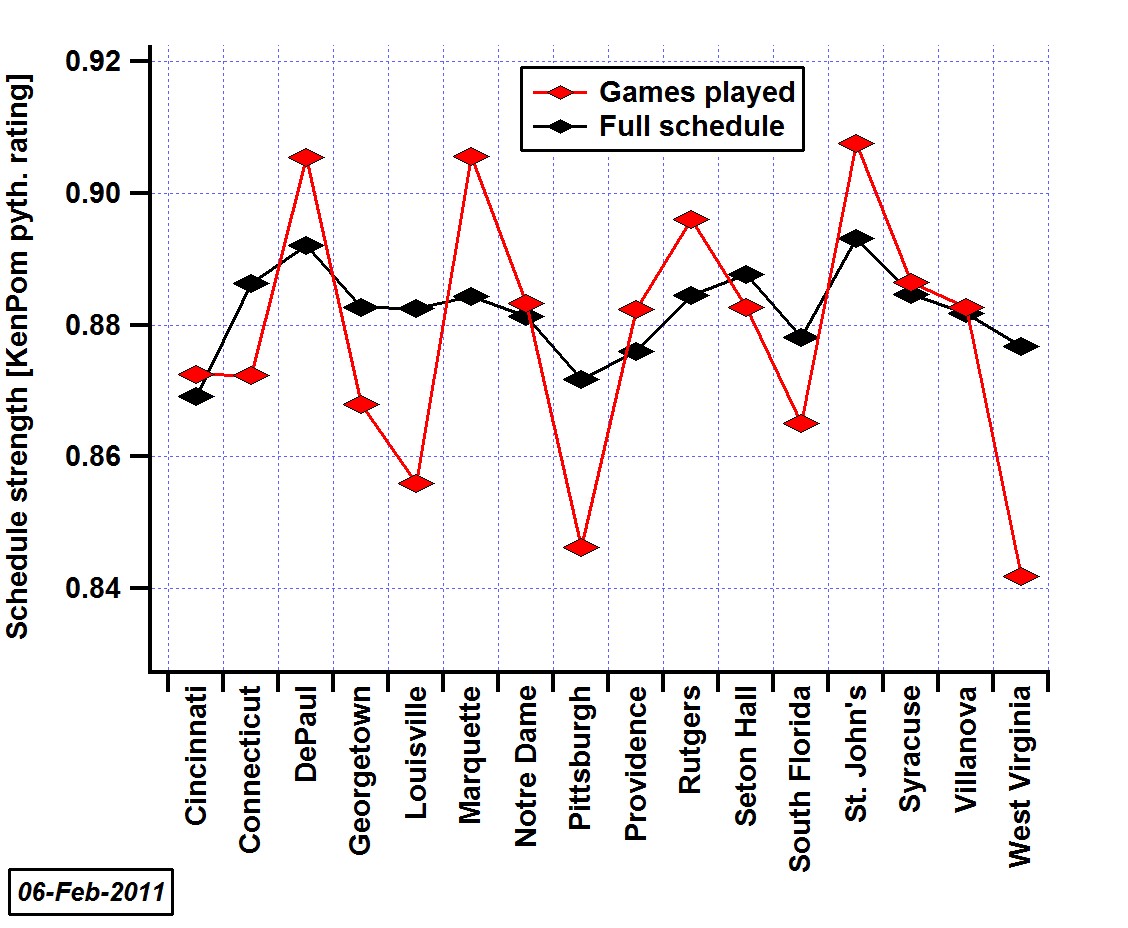
This plot, based upon stats for games played through Feb. 6th, uses KenPom.com's adjusted off. and def. efficiencies and a weight for home and road games to estimate the strength of schedule for all of the Big East teams (see this post for more info).
At the end of the season, the difference between the easiest and hardest conference schedules (Cincinnati and St. John's, respectively) will be about the difference between having to play Duquesne [33rd] and Wichita St. [39th] on a neutral court, as of this writing - a small effect.
But right now, with about 60% of the conference season in the books, the difference between easiest and hardest schedule for games played is much larger. Right now, West Virginia has enjoyed the softest slate, while the aforementioned Johnnies have had it tough all over. This difference translates into playing UNLV [28th] or USC [48th] - a much bigger effect now than how it well end up at the end of the year.
There are two pieces of wisdom I hope you take away from the above chart:
- The remaining schedule strength is going to vary a lot between teams. West Virginia and Louisville particularly will have a tough time, along with Pitt, So. Florida and our own Georgetown Hoyas. On the other side of the coin, especially Marquette and Rutgers but also St. John's and DePaul will have an easier path.
- If you try to compare stats that teams have accrued during the conference games so far, the difference in schedule strength is almost certainly going to bias your results.
Now to be clear, I'm not saying that John Gasaway's "truths" will never be true; in fact, as the conference season nears completion and the variance of schedule strengths shrinks, the beauty of John's method is revealed.
Allow me another plot. Here, we'll look at the relationship between Big East end-of-season conference winning percentage and net efficiency, unadjusted for schedule.

As shown in the figure, this dataset is from the past six seasons (i.e. as long as JT3 has been at Georgetown).
I've shown this before, but it's been somewhat modified so I thought it would be worthwhile to go through all of the details:
- The dataset uses all Big East games, including games from the Big East tournament most seasons.* Other plots and data refer only to regular season conference games. (*While writing this up, I noticed at least the 2009 BET didn't make it into the database. I'll have to get those stats in later.)
- The data points are color-coded by season, and I've also highlighted those six points that represent the Hoyas with extra-thick border - the highest net efficiency by any team from the past six years was your 2007 Georgetown Hoyas.
- I've fitted a curve to the data, shown as the solid gray line, along with 95% prediction bands about that fit as shown by the dashed gray lines. The fit is what we call an S curve or Sigmoid function. Well beyond the scope of what I've got time to cover tonight, but it's more appropriate than a simple linear fit.
- There are three outliers in the data set:
- The 2009 DePaul Blue Demons are the only team to have not won a single game during a conference season - their net efficiency lies far to the left (the bad side) of the rest of the distribution of data points. That was easily the worst season in the databank.
- The unluckiest season belongs to the famously snake-bitten Notre Dame Fighting Irish of 2006. That team lost all four Big East games that went to overtime, along with the four other games that were decided by 4 points or less. To top it off, their season ended after a 2OT loss in the NIT.
- The luckiest team of the past six years was also from 2006, the Syracuse Orange. That luck came during the improbable run through the Big East tournament.
- While net efficiency does a good job predicting final conference record, it does even better predicting post-season success. I won't go into the details here, but I took a look at this for the season preview; very briefly, post near +10 net efficiency and you should make the Sweet 16, get up near +15 net efficiency and you're a legit contender for the Final Four.
To bring us back to the whole point of this post ("There was a point?"), my discomfort with John Gasaway's Tuesday Truths lies not with their ultimate reveal, but rather with the information gleaned mid-stream. I believe I know the answer, but I've always wondered why John doesn't adjust off. and def. efficiency for competition, a la Ken Pomeroy. The reason is likely two-fold: the math is not simple, and in fact can be tedious when you're tracking many conferences; and the method is not transparent - raw off. and def. efficiencies employ no statistical shenanigans but are simply how the teams played on the court, and in that sense are unassailable.
But assail I must, and here's why. The error in our way can come from extrapolating the current net efficiencies for our favorite team to the end-of-season. That is, if we use last week's Tuesday Truths column as a simple model for how the rest of the season will turn out, we may be led astray.
Here comes another plot:

Here I'm relating the final net efficiency for Big East teams over the past three seasons, versus the data from the Tuesday Truth column John Gasaway put out about this far into the BE season (links: 2008, 2009, 2010). The data points use the same color-scheme as the previous plot to indicate season, and the solid and dashed gray lines also have the same meaning as above, although here the fit is simply linear. I've added an additional line, a green 1:1 line, that shows the difference between it and the slope of the fitted line.
About this time of the conference season, the Tuesday Truth indeed does a good job identifying the good and bad teams.
But what would happen if we were to adjust all of John's stats for the quality of competition the teams had played up to that point? I've gone ahead and done just that using KenPom's standard adjustment method, and using Ken's end-of-season adjusted off. and def. efficiencies to work out schedule strength (as described near the top).
Yet another plot:

There is clear improvement to the model. There is a small reduction in scatter, causing the 2008 Seton Hall season to now stand out as a big negative outlier (Paul Gause blew out his knee right about the time of John's article from 2008). The closest we have to a postive outlier is the all-Gody to Gody-less Fighting Irish of last season, whose remarkable reinvention as Wisconsin-east caused Dan Hanner's head to explode.
But more importantly than being able to explain away outliers, the fit of the line is now nearly on top of the 1:1 line - that is, once we adjust the mid-season net efficiencies for competition, we have a fairly accurate model of final net efficiencies, i.e. how good the teams really are and how they can be expected to perform in post-season.
Now I didn't do all this work just for fun - at the end here I need to bring it back to my beloved Georgetown Hoyas.
The news isn't good.
As was shown in the first plot, the Hoyas have enjoyed a relatively easy schedule to date (that will soon be changing), and haven't taken advantage of it. We can incorporate that schedule into their net efficiency; in fact, why don't we just do that for all Big East teams:
The changes are subtle, but they are there. Gasaway would peg West Virginia as the fourth-best team in conference, but our corrections show they are really only seventh-best so far. Marquette(!) is playing nearly as well as Villanova, despite the difference in records, and may be poised for a post-season run. And so forth.. Raw Adjusted Team Net Eff. Rank Net Eff. Rank Cincinnati 0 10 0 10 Connecticut 4 8 3 8 DePaul -24 16 -22 16 Georgetown 3 9 2 9 Louisville 6 5 4 6 Marquette 7 3 9 3 Notre Dame 4 7 4 5 Pittsburgh 17 1 15 1 Providence -6 13 -6 14 Rutgers -6 12 -5 12 Seton Hall -4 11 -4 11 South Florida -10 15 -12 15 St. John's -7 14 -5 13 Syracuse 6 6 6 4 Villanova 10 2 10 2 West Virginia 6 4 3 7
But the more disquieting lesson we drew from this exercise is from that last plot - we can peg Georgetown's final efficiency with 95% confidence from what we've seen so far: over eleven games, the Hoyas have outscored their opponents by only 2 adjusted points per 100 possessions [or 0.02 PPP], and can't even be considered one of the top 8 teams in the league.
The odds are about 20:1 against the team making the leap to what I've previously described as "very good" by Big East standards, to a team expected to make the Sweet 16. Now extenuating circumstances (e.g. seeding) can play a role, but perhaps it's time for Georgetown fans to scale back their post-season plans.
Awesome analysis (though I have to say rather depressing!).
ReplyDeleteOne thought I had is that our beloved Hoyas may be unfairly weighed down by their ridiculously poor performance in the 4 conference losses. From watching the games, I honestly believe there was a fundamental adjustment made to our defense in that week long break prior to our second meeting with St. Johns. There's nothing you can really do with that hypothesis in terms of data analysis but just something to consider.
I'm still clinging to hope but I believe this year might actually be a year we are an outlier to your model (assuming our mid-conference adjustments are truly indicative of the future).
That the Hoyas would be the outlier was my hope as well - there was clearly a step change improvement in defense starting with the second St. John's game.
ReplyDeleteBut the Providence game was a return to that poor form.
I just don't think this team can play great defense for long stretches. If Clark and Wright could play as well as they did in the non-conf stretch, the Hoyas could do some damage. But those two have been inconsistent at best.
Looking at the Team Adv. Stats for conference games this season, the problem has been 2nd half defense:
ReplyDeleteOE 1st Half 103.4
DE 1st Half 97.4
OE 2nd Half 110.7
DE 2nd Half 110.7
Last year's team was better in the 2nd half than in the 1st in conference. The DE was mediocre in both halves (102.9, 103.0) but the offense was much better in the 2nd half (103.9, 117.0).
08-09 team was good 1st half, terrible 2nd half defensive team in conference (DE 94.0, 110.0) with a consistently mediocre offense incapable of outscoring opponents in the 2nd half.
07-08 team crushed teams defensively in the 1st half (84.6 DE) then coasted a bit in the 2nd half (101.7) with enough offense to win.